What’s New
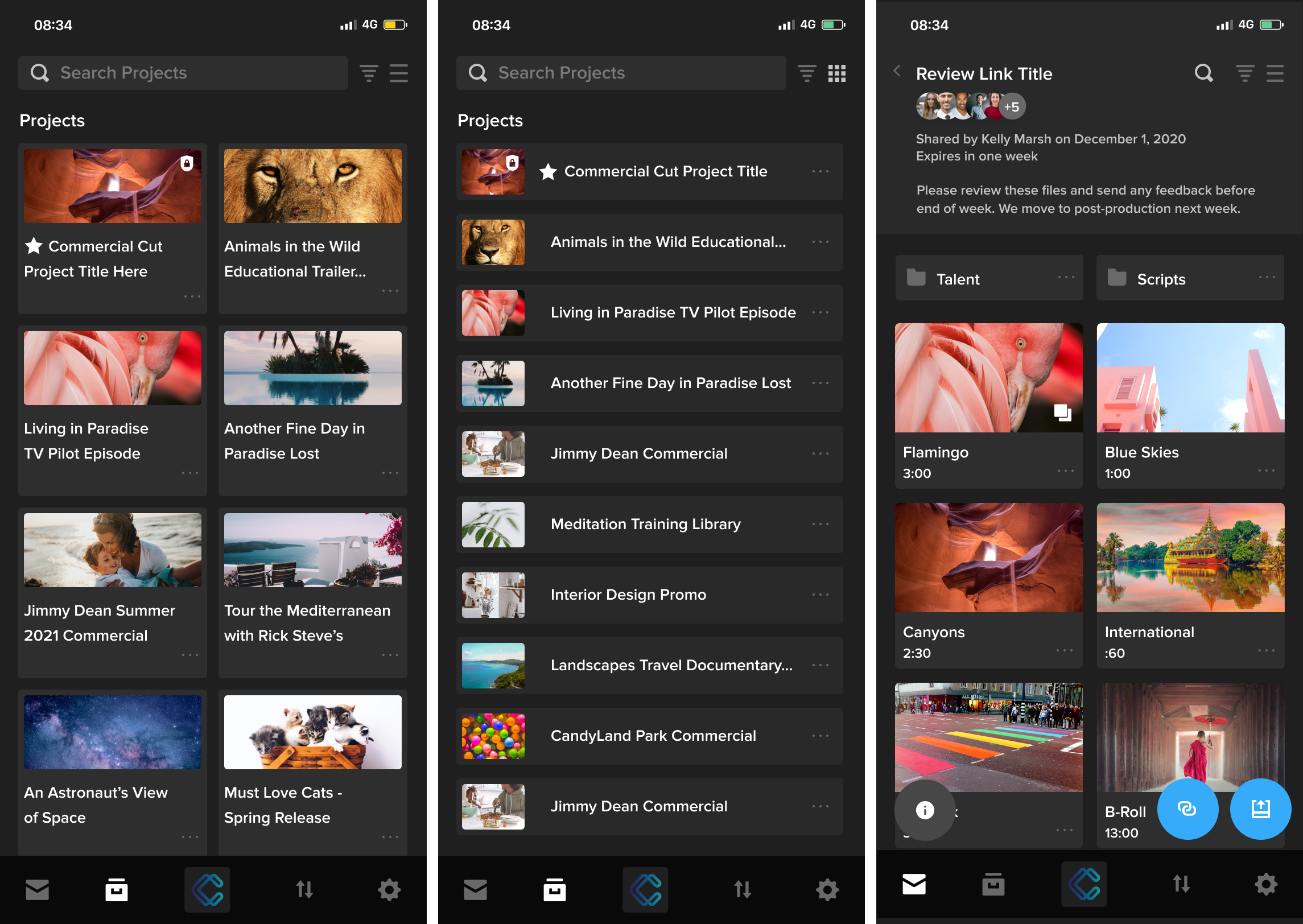
- The app now has a more compact layout that fits more of your projects on the screen at once. You can also view twice as many feed cards on the screen without needing to scroll down.
- You’ll notice more options menus throughout the app. Just tap the three-dots icon to reveal additional options, like sharing folders and copying project URLs to share with your team.
- When you review a link with multiple files, the review gallery now includes sender and audience information at the top of the screen, in addition to the link title and description. The gallery also displays more thumbnails at once.
- Finally, we’ve made some additional design updates for a more consistent experience between our desktop and mobile apps.


